
Handwriting Practice Paper: How to Choose Baseline, Midline, and Line Height
A single line isn't enough to teach letter formation. Learn how baseline, midline, and topline work together, how to size them by skill and millimeter height, and how to print practice sheets that actually help handwriting improve.
Tip: Reduce guide lines in stages, not all at once. Moving from a full baseline-midline-topline band straight to plain paper is a bigger jump than dropping one line at a time.
Why a Single Line Isn't Enough for Handwriting
Standard notebook paper gives a writer exactly one piece of information: where the bottom of a letter sits. It says nothing about how tall a letter should be, where a rounded letter like a or o should stop, or how far a letter like g or p should drop below the line. Without those references, handwriting practice turns into guesswork, and inconsistent letter height is one of the most common problems teachers and occupational therapists see in handwriting samples.
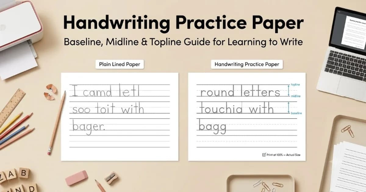
Dedicated handwriting practice paper solves this by adding extra reference lines above the baseline. Instead of one line, the writer sees a small band that defines the full height and internal proportions of each letter, which is much closer to how handwriting is actually taught in a lesson or therapy setting.
The Baseline, Midline, and Topline System
Most handwriting guides use some version of a three-line band. The baseline is the solid bottom line that every letter sits on. The topline is a solid line above it that marks the full height of capital letters and ascenders such as b, d, h, k, and l. Between the two sits a midline, usually drawn as a lighter or dashed line, marking where lowercase letters without ascenders or descenders should stop, including a, c, e, m, n, o, r, s, u, v, w, x, and z.
Letters with descenders, such as g, j, p, q, and y, cross below the baseline into the space below the band. Some practice sheets add a second, lighter line under the baseline specifically to cap how far a descender should drop, which keeps loops from growing wider with every line of practice.
Keeping the midline visually lighter than the baseline and topline matters more than it looks. A learner needs to register the midline as a target, not as a boundary with the same weight as the true top and bottom of the letter, or every lowercase letter starts to creep toward full capital height.
Choosing Line Height by Skill and Millimeter Size
Line height should shrink gradually as fine motor control improves, not jump straight from oversized practice bands to adult notebook spacing. A few commonly used ranges as a starting point:
1. Large letterforms (roughly 18 to 20mm total band height): plenty of room for whole-arm letter formation before fine finger control is reliable — useful in occupational therapy, calligraphy drills, and first-pass proportion work.
2. Intermediate bands (roughly 12 to 15mm): small enough to start building consistency while still forgiving of uneven strokes.
3. Tightening toward notebook ruling (roughly 9 to 11mm): closer to standard wide-ruled paper, as writers move from practice sheets to everyday notes.
4. Everyday note-taking: standard College Ruled (7.1mm) or Wide Ruled (8.7mm) spacing, matching lined paper used for lectures, journals, and professional notes.
These figures are reasonable starting points rather than fixed rules. Curricula and occupational therapy programs vary, and a writer who needs more or less space often benefits from one size larger or smaller than the default for that skill stage.
Dashed Midlines and Slant Guides for Cursive
For print handwriting, a dashed or dotted midline gives just enough visual guidance without becoming another line to trace exactly, which keeps the writer's attention on the letter shape rather than the ruling. Solid double lines work better for tracing practice, where the goal is to fill in a specific target rather than judge proportions independently.
Cursive practice adds a third consideration: slant. Because cursive letters lean at a consistent angle, some practice sheets add faint diagonal guide lines running through the baseline and topline at roughly 55 to 65 degrees. These help a writer keep letter slant consistent across a line, which is often harder to self-correct than letter height.
For first-pass practice, it helps to reduce the amount of guidance gradually: start with a full baseline, midline, and topline band, then move to baseline and midline only, then to baseline alone once letter proportions are consistent without the extra references.
Tips for Left-Handed Writers
Left-handed writers often push the pencil rather than pull it, which changes how letters form and how the hand covers or uncovers the writing line. A slightly wider left margin gives more room to angle the page without the hand running off the edge of the paper, and it also leaves space for hole punching or spiral binding without cutting into the writing area.
Angling the page itself, rather than only the hand, tends to matter more for left-handed comfort than line spacing does. Tilting the paper roughly 30 to 45 degrees clockwise lets a left-handed writer see the line they are forming instead of writing underneath their own hand, which reduces smudging and awkward wrist position over a long practice session.
Customizing and Printing Practice Sheets
1. Line color: light gray or light blue guide lines are easier to write over than solid black, since they recede visually once the pencil or pen marks are on the page.
2. Line weight: keep the baseline and topline slightly heavier than the midline so the eye can tell them apart at a glance, especially for beginners.
3. Block spacing: leave a small gap between each practice band rather than stacking them edge to edge, so a stray descender from one line doesn't visually run into the topline of the next.
4. Ink use: for long practice packets, thinner line weights in light gray print cleanly while using noticeably less ink than solid black rules, which matters when printing dozens of sheets for a workshop or training packet.
As with any printable grid, set the printer to 100 percent scale and turn off fit-to-page before printing, since scaling changes the actual line height on the page and can quietly turn a carefully chosen band size into the wrong one.
Build a custom handwriting practice sheet
Choose guide line count, line height, and block spacing, then export a print-ready PDF, PNG, or SVG.
Open Handwriting Practice Paper Tool